

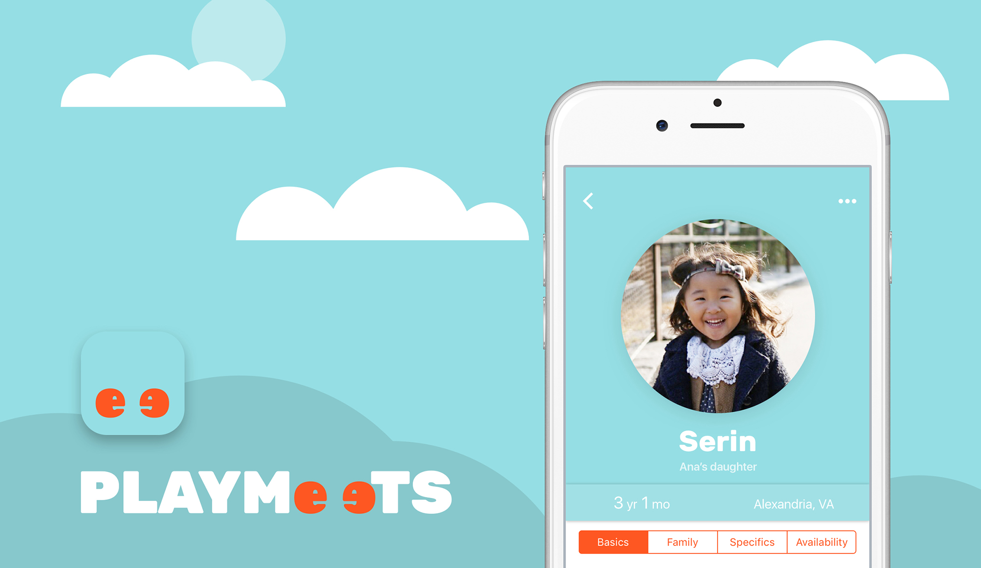
Create the design for an app for stay-at-home moms and dads to find compatible playmates nearby for their young child(ren).
Feel free to jump straight into the prototype below (or experience it full screen on mobile) if you reeeeally can’t wait. But make sure you come back to read the rest!
I have a better relationship with my sister-in-law, Ana, than I do with my brother (sorry, oppa, you know it's true though!), or with most people for that matter. After the birth of my now 3-year-old niece Serin and subsequently her 5-month-old sister Yerin, our relationship has continued to grow, and so has my knowledge of all things infant-related. Of countless parenting adventures, the one that Ana, as a stay-at-home mom, has invested the most effort in is finding nearby friends for both Serin and herself (it’s important the parents get along well too), and now Yerin. It turns out that for playmates to be suitable, there are quite a few preferable qualifications. As I later confirmed with my own research, Ana told me that of the few similar apps already out on the market, such as Mom Co and Hello Mamas, most were focused primarily on the moms making mom friends and planning playdates and event outings with them. For Ana and the moms and dads she knows, it’s easy to find local events on neighborhood Facebook groups; the greater difficulty is in finding the right friends. (Odd how that continues well into adulthood…)
As I set out to solve this problem, I had a couple overarching goals for the application itself and some for my development as a designer.
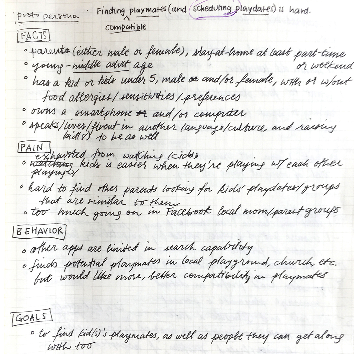
With Ana’s help, I was able to get in contact with several stay-at-home parents, ranging in age from 27 to 42, primarily in the Northern VA area. This data, as well as general background knowledge, helped to pin where the target audience demographics lay and determine things like the age range selections for the filter feature. Speaking with these parents—each with different priorities when seeking new playmates for their little one(s)—allowed me to investigate what these priorities were.
A primary priority of Ana’s, as a Korean-American who speaks both languages fluently, was to find playmates who are being raised ambiculturally (able and willing to live seamlessly in two cultures/languages) in English and Korean as Serin is. Interestingly, according to research by the U.S. Census Bureau in 2013, 21 percent of the U.S. population speak a language other than English at home. (That was four years ago, and even then that means 1 in 5 people. Holy moly.)
I asked these parents what was most important to them in finding playmates, in order to paint a consensus for what the pertinent filterable criteria would be. Here is a list of what I gathered, loosely from most to least important:
During our interview session, one mom quietly brought up the fact that the other parents' education level was a factor for her. Although I valued all the input, I had to determine which pieces of data would be applied in the end; majority and an effort to keep the focus on the child, rather than the parent, ruled out.
Another thought was that there may be some parallels with dating apps. So in addition to other playdate-related apps on the market, I took note of some of the features and information architectures of dating apps as well.
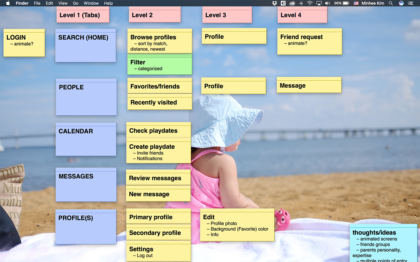
Now I know, typically, information architecture in the form of a site outline and/or flowchart is the first step of creating an app or product, and once that’s in place, wireframes come after. In this case, I found the process involved:
Naturally, once I brought the work into Sketch, I found myself wanting to make visual design decisions. This seemed like a good place to pause everything and devise the brand identity and guidelines before things got out of hand.
I’ve always been an artist most inspired by color and color palettes. Whether I’m starting work on an illustration, picking out pieces for an outfit, or, as in this case, creating the visual identity of a brand, just having the right color or colors can create the particular look and feel I’m hoping to achieve. So I started there. For the Playmeets identity, I decided to begin with a single brand color to place focus on the content. I wanted the color to evoke playfulness and youth, so after playing with countless shades of yellows and some greens and oranges, I chose a yellow that was dark enough to use with large white text without looking muddy. After pairing it with a subdued plum magenta and designing out the preliminary screens to gain a sense of the look and feel, I liked it … until I didn’t. The more I looked at the colors, the more the yellow felt dull and the colors together too feminine.
Back to the palette of potential colors I went, and I fixated on a bright orange that my eyes kept returning to. It was only a hair off from the shade Flame from the Pantone Spring 2017 palette, which I googled, immediately loved, and set as my primary brand color. Then I added a light cyan from the other end of the color wheel as a secondary brand color, which added to the look & feel and worked perfectly for the sky background.
The name Playmeets was a natural derivation of the app’s primary function: to help the user meet new playmates. Since the term playmate is defined as “a friend with whom a child plays,” it’s another clue of what/who the app is for.
To arrive at the name, I wrote out all the keywords pertaining to the app: playmate, nearby, compatible, playdate, play, meet, find, friend. Then I wrote out the feelings the name should exude: playful, happy, childlike, bubbly, easy. From there, I made word maps of each of these words and their combinations. I liked ones that could be read in two ways, like Let'sPlayMate, but wanted something that was shorter and cleaner. At one point, I kept writing and mouthing the words meet and playmates, and it finally dawned on me how similiar the words sounded. From there, it was just a matter of frankensteining the two together.
Even before the name was determined, I knew I wanted to have some sort of characters that would personify the brand and represent the little ones. With that in the back of my head, I sketched out a few ideas until I happened on the idea of using the ‘ee’ in the name as two kid characters, with the second ɘ reversed to face the first e. That led to stylizing the name as ‘PLAYMeɘTS’ so that the ‘eɘ’ were clearly shorter, therefore, the children. I went back and forth between that and the more direct, titlecase ‘Playmeɘts’ and eventually stuck with the stylized spelling because the look of it in Rubik Black grew on me. More on that in the next paragraph.
The demographic of the typical Playmeets user—parent in late young adulthood to early middle adulthood—generally points to someone who is too busy to worry about keeping up with the latest and greatest, but would appreciate a clean, easy, and engaging interface. Keeping that in mind, I tried to keep the typography straight-forward. For the majority of the app, I stuck to SF UI Text and Display in styles that would be familiar to iOS users. For the brand font, I chose the Bold weight of Hubert & Fischer’s fantastic Rubik. It struck all the notes I was going for: playful and lighthearted with considerable heft and presence, proportionately geometric, rounded but not too much as to make it bubbly. It was love at first sight. 😍
One other note about my use of Rubik: in the Heavy weight, it created a near exact form of the kind of e’s I wanted to use for my Playmeets characters. With just a slight modification, the logo, in both its full ‘PLAYMeɘts’ and short ‘eɘ’ variations, was good to go.
Part of the brand identity also included things like appropriate tone of the copy throughout the app. Not being much of a writer in a way I wish I was, this part was difficult. I presume if this were a real product and the team consisted of more than just me, this role would go to someone else. Still, I tried my darndest to keep the copy friendly, useful, actionable, and concise (unlike this case study—sorry!).
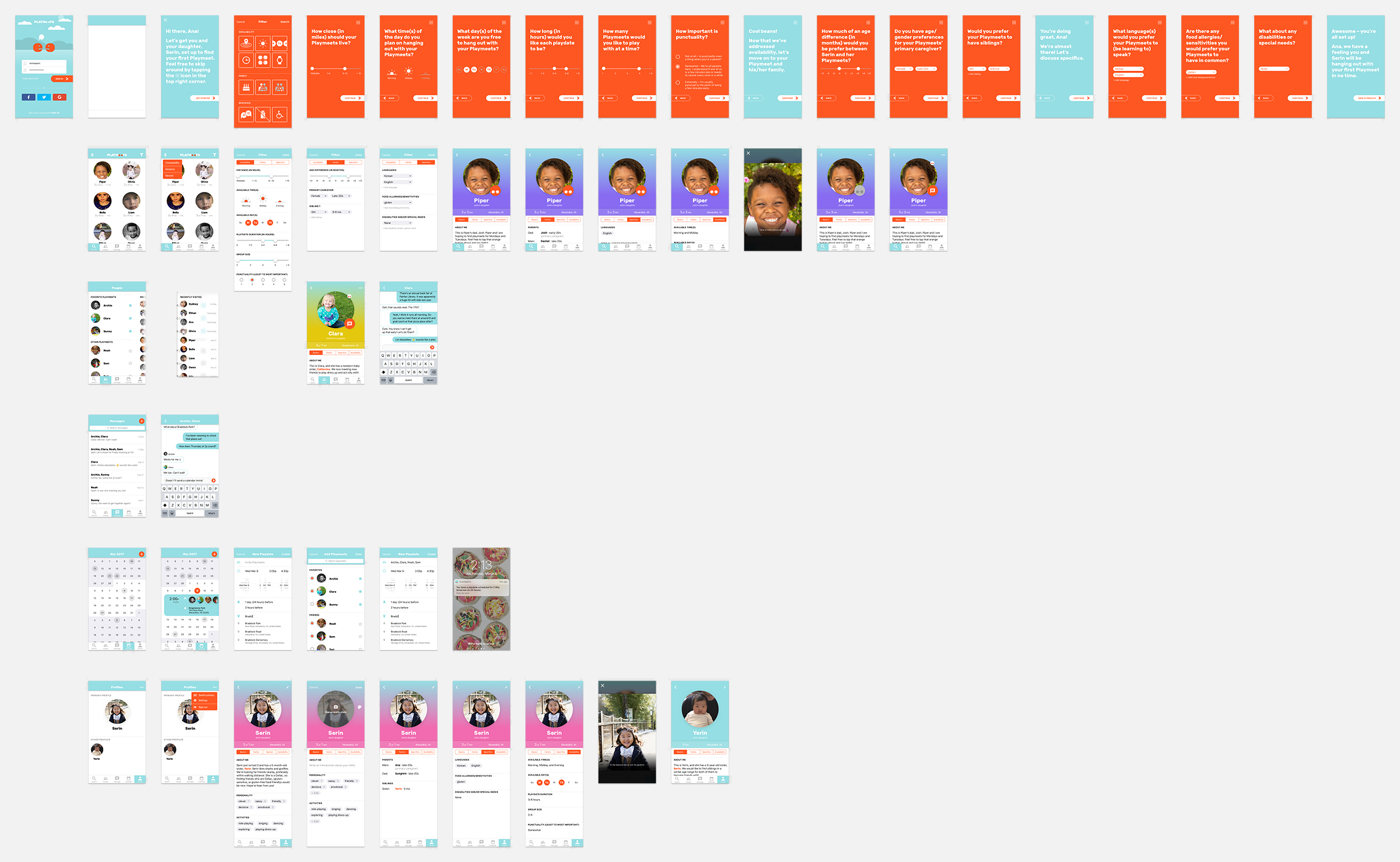
For much of the work, I just made sure to create designs that made sense, was easy to follow, and fit the brand identity. Honestly, having a solid IA in place and not jumping into the visual design prematurely made the process delightfully clean. (I mean, honestly, you can’t hang pictures on the wall of a house that doesn’t exist.) In addition, taking a closer look at the apps I have installed on my phone and learning how they treated certain features was extremely helpful. By digging into what choices those designers made and why, I was able to make better informed design decisions for my own app.
One feature I wanted to highlight was Search/Filter. I initially wireframed and designed your typical filter selections screen, as such:
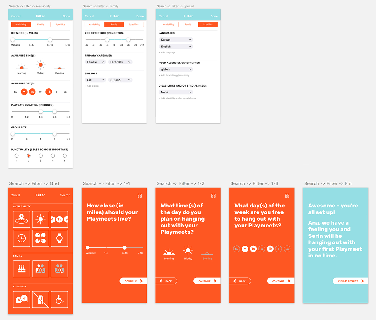
Then, I quickly realized that for an app with the primary function of searching efficiently, this wouldn’t give the function its due importance and presence. In trying to achieve that, I got to remembering what an ordeal internet setup used to be and how different my last one a year ago was. The key difference was that the user experience was led by a cheery and thorough setup assistant. As gimmicky as that sounds, it was much more pleasant than dealing with a bunch of radio buttons and bars, with confusing categories that sound as if written by a robot. Inspired, I created a setup assistant for finding playmates that I think worked out pretty nicely.
While working on the Playmeets ‘eɘ’ mark, I realized animating the ‘e’ and ‘ɘ’ would be the only sensible thing to do. Hiding animated nuggets in places where the user should be rewarded—such as opening the app, sending a Playmeets request, gaining Playmeets, creating a new playdate—would keep the Playmeets app fun and engaging.
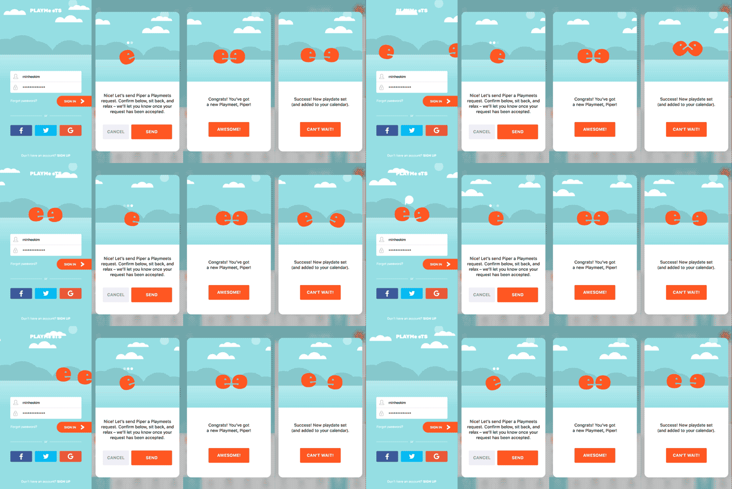
Since short of an actual working app, a prototype is the best way to fully demonstrate the Playmeets user experience (including the UI), here is the prototype of the app.
In the two weeks I spent working on this project, I come away with lessons learned and ideas for furthering work on the app.
I was encouraged by a wonderful friend to include more digital work in my portfolio, and that prompted this project I enjoyed and learned much from. So I thank her, and, thank you so much for reading!
Head over to my Behance to see more (mostly older) work.
Check out my Instagram to see examples of my off-hours creative thinking.
Read more about me, or drop me a line.